공정에서 이상치를 발견하거나, 금융 사기, 수요 예측 등 이상치 감지는 상당히 많이 쓰인다. 이상치가 있다는 건 기존의 데이터가 어느 정도 패턴을 가지고 있다는 뜻이기도 한데, 이번에는 데이터 분석을 통해 그 패턴이란 것이 존재하는 지를 찾기 위한 t-SNE를 본다. 다른 한편, 이상치라는 것이 상당히 unbalanced 데이터이기 때문에 학습이 제대로 되지 않는 경우가 많다. 이런 경우, 이상치의 개수를 늘려 학습하도록 하는 SMOTE를 적용해 볼 예정이다.
분석 예제는 Kaggle의 Credit Card Fraud Detection을 활용할 것이고,
Credit Card Fraud Detection
Anonymized credit card transactions labeled as fraudulent or genuine
www.kaggle.com
해당 예제의 가장 핫한 커널인 아래의 내용을 실행해 본 수준으로 이해할 것이다.
Credit Fraud || Dealing with Imbalanced Datasets
Explore and run machine learning code with Kaggle Notebooks | Using data from Credit Card Fraud Detection
www.kaggle.com
해당 competition에서 데이터를 다운 받아 저장해 두고, 필요한 라이브러리를 import 한 뒤 읽어들이자.
import numpy as np # linear algebra
import pandas as pd # data processing, CSV file I/O (e.g. pd.read_csv)
import tensorflow as tf
import matplotlib.pyplot as plt
import seaborn as sns
from sklearn.manifold import TSNE
from sklearn.decomposition import PCA, TruncatedSVD
import matplotlib.patches as mpatches
import time

# Classifier Libraries
from sklearn.linear_model import LogisticRegression
from sklearn.svm import SVC
from sklearn.neighbors import KNeighborsClassifier
from sklearn.tree import DecisionTreeClassifier
from sklearn.ensemble import RandomForestClassifier
import collections

# Other Libraries
from sklearn.model_selection import train_test_split
from sklearn.pipeline import make_pipeline
from imblearn.pipeline import make_pipeline as imbalanced_make_pipeline
from imblearn.over_sampling import SMOTE
from imblearn.under_sampling import NearMiss
from imblearn.metrics import classification_report_imbalanced
from sklearn.metrics import precision_score, recall_score, f1_score, roc_auc_score, accuracy_score, classification_report
from collections import Counter
from sklearn.model_selection import KFold, StratifiedKFold
import warnings
warnings.filterwarnings("ignore")

df = pd.read_csv('creditcard.csv')
df.head()
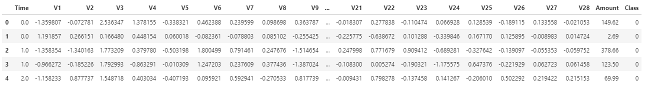
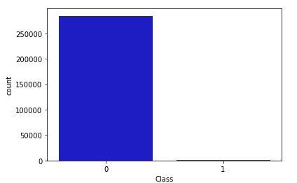
Class 항목이 비정상 거래인지를 나타낸다. 나머지 필드들은 보안 요건 상 V1~V28로 표기해 두었다고 한다. 데이터 탐색을 통해 주요 인자를 밝혀낼 것이므로 어차피 몰라도 된다. class의 분포를 보면 이야기한 대로 상당히 imbalance하다.
colors = ["#0101DF", "#DF0101"]
sns.countplot('Class', data=df, palette=colors)
데이터 중에 'Amount'와 'Time'만 변수의 범위가 크기 때문에 scaling을 통해 수준을 맞춘다.
from sklearn.preprocessing import StandardScaler, RobustScaler

rob_scaler = RobustScaler()
df['scaled_amount'] = rob_scaler.fit_transform(df['Amount'].values.reshape(-1,1))
df['scaled_time'] = rob_scaler.fit_transform(df['Time'].values.reshape(-1,1))

# time과 amount는 삭제
df.drop(['Time', 'Amount'], axis=1, inplace=True)
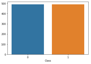
데이터가 unblance 하기 때문에, 정상 데이터를 이상 패턴의 데이터 수(여기서는 492개)만큼만 뽑아서(new_df) 우선 학습해 본다.
df = df.sample(frac=1)

# amount of fraud classes 492 rows.
fraud_df = df.loc[df['Class'] == 1]
non_fraud_df = df.loc[df['Class'] == 0][:492]

normal_distributed_df = pd.concat([fraud_df, non_fraud_df])
new_df = normal_distributed_df.sample(frac=1, random_state=42)

sns.countplot('Class', data=new_df)
각 변수가 class에 미치는 상관성을 우선 heatmap을 통해 찾아본다.
sub_sample_corr = new_df.corr()
sns.heatmap(sub_sample_corr, cmap='coolwarm_r', ax=ax2)

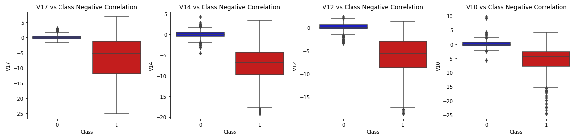
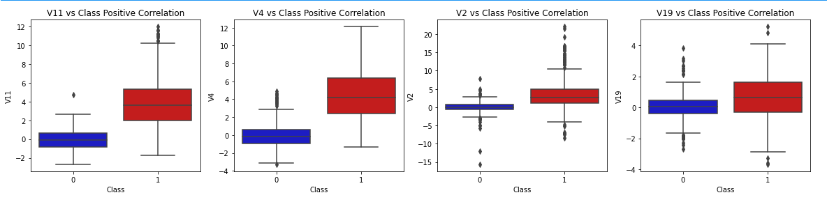
V10, V12, V14, V17은 음의 상관성(class와의 교차점이 빨간색에 가까움)을 보이고, V2, V4, V11, V19은 양의 상관성(class와의 교차점이 파란색에 가까움)을 보인다. boxplot으로 확인해 보자.
f, axes = plt.subplots(ncols=4, figsize=(20,4))

# Negative Correlations with our Class (The lower our feature value the more likely it will be a fraud transaction)
sns.boxplot(x="Class", y="V17", data=new_df, palette=colors, ax=axes[0])
axes[0].set_title('V17 vs Class Negative Correlation')

sns.boxplot(x="Class", y="V14", data=new_df, palette=colors, ax=axes[1])
axes[1].set_title('V14 vs Class Negative Correlation')


sns.boxplot(x="Class", y="V12", data=new_df, palette=colors, ax=axes[2])
axes[2].set_title('V12 vs Class Negative Correlation')


sns.boxplot(x="Class", y="V10", data=new_df, palette=colors, ax=axes[3])
axes[3].set_title('V10 vs Class Negative Correlation')

plt.show()
f, axes = plt.subplots(ncols=4, figsize=(20,4))

# Positive correlations (The higher the feature the probability increases that it will be a fraud transaction)
sns.boxplot(x="Class", y="V11", data=new_df, palette=colors, ax=axes[0])
axes[0].set_title('V11 vs Class Positive Correlation')

sns.boxplot(x="Class", y="V4", data=new_df, palette=colors, ax=axes[1])
axes[1].set_title('V4 vs Class Positive Correlation')


sns.boxplot(x="Class", y="V2", data=new_df, palette=colors, ax=axes[2])
axes[2].set_title('V2 vs Class Positive Correlation')


sns.boxplot(x="Class", y="V19", data=new_df, palette=colors, ax=axes[3])
axes[3].set_title('V19 vs Class Positive Correlation')

plt.show()
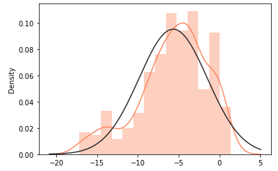
강한 음의 상관성을 갖는 V14, V12, V10의 분포를 보면 V14를 제외하고는 정규 분포에서 살짝 벗어나 있다.
from scipy.stats import norm

f, (ax1, ax2, ax3) = plt.subplots(1,3, figsize=(20, 6))

v14_fraud_dist = new_df['V14'].loc[new_df['Class'] == 1].values
sns.distplot(v14_fraud_dist,ax=ax1, fit=norm, color='#FB8861')
ax1.set_title('V14 Distribution \n (Fraud Transactions)', fontsize=14)

v12_fraud_dist = new_df['V12'].loc[new_df['Class'] == 1].values
sns.distplot(v12_fraud_dist,ax=ax2, fit=norm, color='#56F9BB')
ax2.set_title('V12 Distribution \n (Fraud Transactions)', fontsize=14)


v10_fraud_dist = new_df['V10'].loc[new_df['Class'] == 1].values
sns.distplot(v10_fraud_dist,ax=ax3, fit=norm, color='#C5B3F9')
ax3.set_title('V10 Distribution \n (Fraud Transactions)', fontsize=14)

plt.show()

이전의 Boxplot에서 나타났던 이상치만 제거하고 V12의 분포를 다시 본다. 여전히 좋은 모양은 아니지만 살짝 가까워지긴했다.
v14_fraud = new_df['V14'].loc[new_df['Class'] == 1].values
q25, q75 = np.percentile(v14_fraud, 25), np.percentile(v14_fraud, 75)
v14_iqr = q75 - q25
v14_cut_off = v14_iqr * 1.5
v14_lower, v14_upper = q25 - v14_cut_off, q75 + v14_cut_off
outliers = [x for x in v14_fraud if x < v14_lower or x > v14_upper]
new_df = new_df.drop(new_df[(new_df['V14'] > v14_upper) | (new_df['V14'] < v14_lower)].index)

v12_fraud = new_df['V12'].loc[new_df['Class'] == 1].values
q25, q75 = np.percentile(v12_fraud, 25), np.percentile(v12_fraud, 75)
v12_iqr = q75 - q25
v12_cut_off = v12_iqr * 1.5
v12_lower, v12_upper = q25 - v12_cut_off, q75 + v12_cut_off
outliers = [x for x in v12_fraud if x < v12_lower or x > v12_upper]
new_df = new_df.drop(new_df[(new_df['V12'] > v12_upper) | (new_df['V12'] < v12_lower)].index)

v10_fraud = new_df['V10'].loc[new_df['Class'] == 1].values
q25, q75 = np.percentile(v10_fraud, 25), np.percentile(v10_fraud, 75)
v10_iqr = q75 - q25
v10_cut_off = v10_iqr * 1.5
v10_lower, v10_upper = q25 - v10_cut_off, q75 + v10_cut_off
outliers = [x for x in v10_fraud if x < v10_lower or x > v10_upper]
new_df = new_df.drop(new_df[(new_df['V10'] > v10_upper) | (new_df['V10'] < v10_lower)].index)

sns.distplot(new_df['V12'].loc[new_df['Class'] == 1].values, fit=norm, color='#FB8861')
t-SNE
이제 이번 포스팅의 핵심으로 넘어가서, 이 데이터로 정상 패턴과 비정상 패턴을 구별할 수 있는 지 본다. 여러 방법이 있지만, t-SNE는 기존의 PCA나 SVD보다 뭉쳐지는 데이터 없이 고르게 잘 펴(?) 준다는 장점이 있다. Scikit-Learn의 라이브러리를 아래와 같이 이용한다. (비교를 위해 PCA, SVD도 수행)
X = new_df.drop('Class', axis=1)
y = new_df['Class']

t0 = time.time()
X_reduced_tsne = TSNE(n_components=2, random_state=42).fit_transform(X.values)
t1 = time.time()
print("T-SNE took {:.2} s".format(t1 - t0))

t0 = time.time()
X_reduced_pca = PCA(n_components=2, random_state=42).fit_transform(X.values)
t1 = time.time()
print("PCA took {:.2} s".format(t1 - t0))

t0 = time.time()
X_reduced_svd = TruncatedSVD(n_components=2, algorithm='randomized', random_state=42).fit_transform(X.values)
t1 = time.time()
print("Truncated SVD took {:.2} s".format(t1 - t0))

f, (ax1, ax2, ax3) = plt.subplots(1, 3, figsize=(24,6))
# labels = ['No Fraud', 'Fraud']
f.suptitle('Clusters using Dimensionality Reduction', fontsize=14)


blue_patch = mpatches.Patch(color='#0A0AFF', label='No Fraud')
red_patch = mpatches.Patch(color='#AF0000', label='Fraud')

# t-SNE scatter plot
ax1.scatter(X_reduced_tsne[:,0], X_reduced_tsne[:,1], c=(y == 0), cmap='coolwarm', label='No Fraud', linewidths=2)
ax1.scatter(X_reduced_tsne[:,0], X_reduced_tsne[:,1], c=(y == 1), cmap='coolwarm', label='Fraud', linewidths=2)
ax1.set_title('t-SNE', fontsize=14)

ax1.grid(True)

ax1.legend(handles=[blue_patch, red_patch])


# PCA scatter plot
ax2.scatter(X_reduced_pca[:,0], X_reduced_pca[:,1], c=(y == 0), cmap='coolwarm', label='No Fraud', linewidths=2)
ax2.scatter(X_reduced_pca[:,0], X_reduced_pca[:,1], c=(y == 1), cmap='coolwarm', label='Fraud', linewidths=2)
ax2.set_title('PCA', fontsize=14)

ax2.grid(True)

ax2.legend(handles=[blue_patch, red_patch])

# TruncatedSVD scatter plot
ax3.scatter(X_reduced_svd[:,0], X_reduced_svd[:,1], c=(y == 0), cmap='coolwarm', label='No Fraud', linewidths=2)
ax3.scatter(X_reduced_svd[:,0], X_reduced_svd[:,1], c=(y == 1), cmap='coolwarm', label='Fraud', linewidths=2)
ax3.set_title('Truncated SVD', fontsize=14)

ax3.grid(True)

ax3.legend(handles=[blue_patch, red_patch])

plt.show()
T-SNE took 2.8 s
PCA took 0.0083 s
Truncated SVD took 0.0072 s
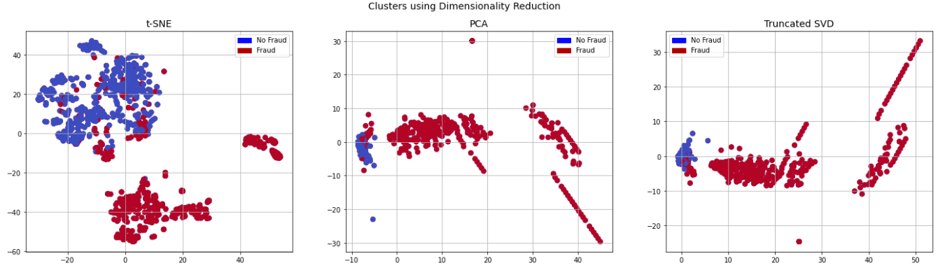
더 많은 연산량을 필요로 하기 때문에 t-SNE가 오랜 시간을 필요로 하지만, 너무 뭉쳐져 있어 구분 여부를 제대로 판단할 수 없는 PCA나 SVD보다는 훨씬 고르게 분포를 보이기도하고, 이 그래프를 통해 정상/비정상 패턴을 (대체로) 구별할 수 있음을 확인할 수 있다.
이제 패턴 구분이 될 수 있음을 확인했으므로, 여러 분류 알고리즘으로 학습해서 결과를 비교해 본다. 학습 방법으로는 Logistic Regression, KNN, SVC, Decision Tree Classifier를 사용했다.
X = new_df.drop('Class', axis=1)
y = new_df['Class']

from sklearn.model_selection import train_test_split

# This is explicitly used for undersampling.
X_train, X_test, y_train, y_test = train_test_split(X, y, test_size=0.2, random_state=42)

# Turn the values into an array for feeding the classification algorithms.
X_train = X_train.values
X_test = X_test.values
y_train = y_train.values
y_test = y_test.values

# Let's implement simple classifiers

classifiers = {
    "LogisiticRegression": LogisticRegression(),
    "KNearest": KNeighborsClassifier(),
    "Support Vector Classifier": SVC(),
    "DecisionTreeClassifier": DecisionTreeClassifier()
}

from sklearn.model_selection import cross_val_score

for key, classifier in classifiers.items():
    classifier.fit(X_train, y_train)
    training_score = cross_val_score(classifier, X_train, y_train, cv=5)
    print("Classifiers: ", classifier.__class__.__name__, " has a training score of ", round(training_score.mean(), 2)*100, "% accuracy")

    # Use GridSearchCV to find the best parameters.
from sklearn.model_selection import GridSearchCV


# Logistic Regression
log_reg_params = {"penalty": ['l1', 'l2'], 'C': [0.001, 0.01, 0.1, 1, 10, 100, 1000]}


grid_log_reg = GridSearchCV(LogisticRegression(), log_reg_params)
grid_log_reg.fit(X_train, y_train)
# We automatically get the logistic regression with the best parameters.
log_reg = grid_log_reg.best_estimator_

knears_params = {"n_neighbors": list(range(2,5,1)), 'algorithm': ['auto', 'ball_tree', 'kd_tree', 'brute']}

grid_knears = GridSearchCV(KNeighborsClassifier(), knears_params)
grid_knears.fit(X_train, y_train)
# KNears best estimator
knears_neighbors = grid_knears.best_estimator_

# Support Vector Classifier
svc_params = {'C': [0.5, 0.7, 0.9, 1], 'kernel': ['rbf', 'poly', 'sigmoid', 'linear']}
grid_svc = GridSearchCV(SVC(), svc_params)
grid_svc.fit(X_train, y_train)

# SVC best estimator
svc = grid_svc.best_estimator_

# DecisionTree Classifier
tree_params = {"criterion": ["gini", "entropy"], "max_depth": list(range(2,4,1)),
              "min_samples_leaf": list(range(5,7,1))}
grid_tree = GridSearchCV(DecisionTreeClassifier(), tree_params)
grid_tree.fit(X_train, y_train)

# tree best estimator
tree_clf = grid_tree.best_estimator_

# Overfitting Case

log_reg_score = cross_val_score(log_reg, X_train, y_train, cv=5)
print('Logistic Regression Cross Validation Score: ', round(log_reg_score.mean() * 100, 2).astype(str) + '%')


knears_score = cross_val_score(knears_neighbors, X_train, y_train, cv=5)
print('Knears Neighbors Cross Validation Score', round(knears_score.mean() * 100, 2).astype(str) + '%')

svc_score = cross_val_score(svc, X_train, y_train, cv=5)
print('Support Vector Classifier Cross Validation Score', round(svc_score.mean() * 100, 2).astype(str) + '%')

tree_score = cross_val_score(tree_clf, X_train, y_train, cv=5)
print('DecisionTree Classifier Cross Validation Score', round(tree_score.mean() * 100, 2).astype(str) + '%')
본 예제에서는 Logistic Regression이 비교적 좋은 결과를 보여주었고, 그 Cross Validation Score도 상당히 높은 편이다.
Logistic Regression Cross Validation Score:  94.97%
Knears Neighbors Cross Validation Score 92.99%
Support Vector Classifier Cross Validation Score 93.65%
DecisionTree Classifier Cross Validation Score 93.12%
SMOTE
마지막으로 imbalanced data를 해결하기 위해 정상 패턴 데이터를 줄여 수량을 맞추는 것이 아니라, 비정상 패턴의 데이터를 늘려 수량을 맞추는 SMOTE(Sythentic Minority Oversampling Technique)를 사용해본다(SMOTE의 자세한 알고리즘은 소개하지 않는다.)
from imblearn.over_sampling import SMOTE
from sklearn.model_selection import train_test_split, RandomizedSearchCV

# List to append the score and then find the average
accuracy_lst = []
precision_lst = []
recall_lst = []
f1_lst = []
auc_lst = []

log_reg_params = {"penalty": ['l1', 'l2'], 'C': [0.001, 0.01, 0.1, 1, 10, 100, 1000]}
rand_log_reg = RandomizedSearchCV(LogisticRegression(), log_reg_params, n_iter=4)

for train, test in sss.split(original_Xtrain, original_ytrain):
    pipeline = imbalanced_make_pipeline(SMOTE(sampling_strategy='minority'), rand_log_reg)
    model = pipeline.fit(original_Xtrain[train], original_ytrain[train])
    best_est = rand_log_reg.best_estimator_
    prediction = best_est.predict(original_Xtrain[test])

    accuracy_lst.append(pipeline.score(original_Xtrain[test], original_ytrain[test]))
    precision_lst.append(precision_score(original_ytrain[test], prediction))
    recall_lst.append(recall_score(original_ytrain[test], prediction))
    f1_lst.append(f1_score(original_ytrain[test], prediction))
    auc_lst.append(roc_auc_score(original_ytrain[test], prediction))

print("accuracy: {}".format(np.mean(accuracy_lst)))
print("precision: {}".format(np.mean(precision_lst)))
print("recall: {}".format(np.mean(recall_lst)))
print("f1: {}".format(np.mean(f1_lst)))
별다른 전처리 없이도 좋은 성능을 보여준다.
accuracy: 0.941948291568519
precision: 0.060257756344863446
recall: 0.9111976630963973
f1: 0.1112371941618497
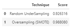
이제 Cross Validation이 아닌 Test Data로 예측치를 비교해 보자.
# Final Score in the test set of logistic regression
from sklearn.metrics import accuracy_score

# X_test는 정상 패턴을 492개로 맞춘 것에서 일부(20%)를 뽑아낸 것
y_pred = log_reg.predict(X_test)
undersample_score = accuracy_score(y_test, y_pred)

# original_Xtest는 전체 데이터 중 일부(20%)를 뽑아낸 것
y_pred_sm = best_est.predict(original_Xtest)
oversample_score = accuracy_score(original_ytest, y_pred_sm)

d = {'Technique': ['Random UnderSampling', 'Oversampling (SMOTE)'], 'Score': [undersample_score, oversample_score]}
final_df = pd.DataFrame(data=d)

final_df
Undersampling한 결과보다 SMOTE를 통해 Oversampling한 결과가 많이 좋아보인다. 형태를 유지하며 비정상 데이터를 더 많이 만들어 내어 학습의 양을 늘려주는 것이 좋은 결과를 보여줌을 알 수 있다.
'AI 빅데이터 > 후려치는 데이터분석과 AI 알고리즘' 카테고리의 다른 글
| [데이터분석] Feature Engineering 7가지 팁 (0) | 2021.01.11 |
|---|---|
| [데이터분석] 비전을 이용한 식물 분류 (0) | 2020.11.08 |
| [데이터분석] 주택가격 예측 Kaggle 도전기 (0) | 2020.09.25 |
| [데이터분석] GAN으로 수치 데이터 생성하기 (2) | 2020.09.17 |
| [데이터분석] 시계열 분석 3 - 딥러닝 (LSTM) (0) | 2020.09.10 |


댓글